

One of my favorite parts of writing Willow Decor is getting to know the many other talented designers, architects, artists and residential photographers that make these beautiful spaces come alive. Meeting photographer Jamie Salomon was one of these special connections. Whether you are aware of it or not, you most likely have already seen his work. It has been featured in many magazines including, Coastal Living, Better Homes and Gardens, New England Home and several others.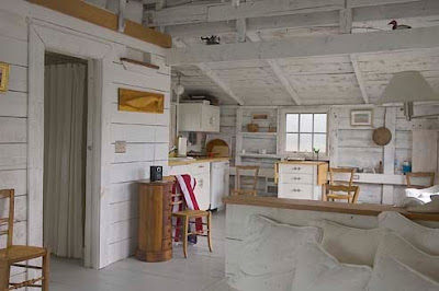
He shared with me this wonderful cottage renovation on the New England coast. As you can see the home is located out on a peninsula. At high tide it becomes an ocean oasis. Though small, it is filled with everything you need to relax. The main room above features a kitchen nook and desk area. 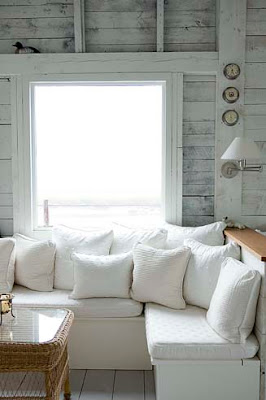
Decorated in soothing whites and grays it is impossible not feel your tension rush away with tide. 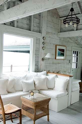 The cottage is sparsely decorated; intentional so you take in the spectacular ocean views. Here is the couch area from a different angle. I love the whitewashed walls which remind me of sun -bleached driftwood.
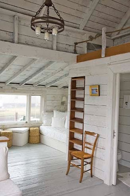 Opposite the seating area is a ladder to the loft above and a daybed tucked below. As you can imagine the views from every direction are breathtaking.
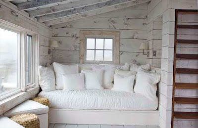
The cottage is sparsely decorated; intentional so you take in the spectacular ocean views. Here is the couch area from a different angle. I love the whitewashed walls which remind me of sun -bleached driftwood. Opposite the seating area is a ladder to the loft above and a daybed tucked below. As you can imagine the views from every direction are breathtaking. Here is a close up of the daybed overflowing with soft pillows. The wonderful sconces provide just the right light for curling up with a good book. 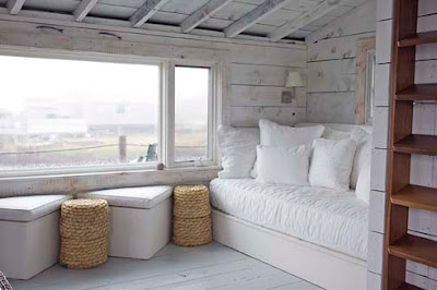 With this view I am quite sure I would never leave - it gives a whole new meaning to word "bed-rest"!
With this view I am quite sure I would never leave - it gives a whole new meaning to word "bed-rest"!


 This photo from Things that Inspire via
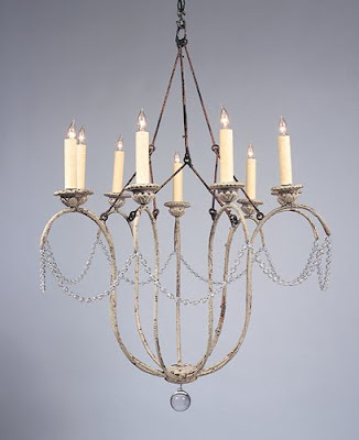
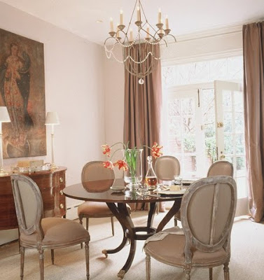
  I am sure you recognize this room from Better Homes and Gardens, which has been all over the blogs. Here you can see an example of the 12 arm style.
 Niermann Weeks writes about the Italian Chandelier on their website.
 I love to find designers who have a look and style that is fresh and fun, but also traditional. Designers who have a coastal look that is so wonderful and leaves you wanting more.
  So I was thrilled to be reacquainted with the work of Molly Frey from Marblehead, Massachusetts via
 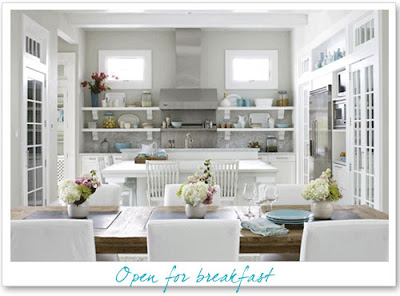 I say reacquainted because I had also seen Molly Frey's work via
  When I went to Molly Frey's


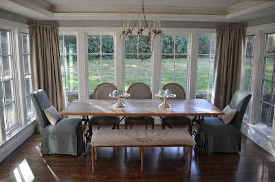
 Here is the breakfast room after!


 We added a gas

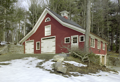 What do you do with an old, dilapidated barn? The rear of this barn had actually collapsed and had to be rebuilt. Here is the before picture.
 The wonderful people at Landmark Services, who are well versed in restoring and renovating, really brought this barn back to life.
  The barn had significant work done including new insulation, plumbing, siding and trim. The doors were replaced to add to the "carriage house" style. The original stone walls were kept. As if the this outdoor renovation wasn't thoughtful enough the owners added a wonderful gem...

 This kitchen from Southern Living turned up both in my inbox and on the Gardenweb! Everyone agreed the windows were wonderful. This kitchen won high marks because of its size, it is so large the storage aspect would not be compromised.
 Another kitchen from Southern Living with a similar feel, though this kitchen had a mix of windowed walls and storage walls. Having both seems to be a popular trade off.
 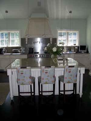 Linda Banks of

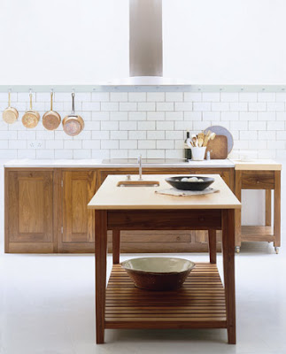 Many of these kitchens highlighted different types of storage - Here we see a copper pot rack on the wall. This could easily free up a lower cabinet for dishes. This kitchen is from Plain English.
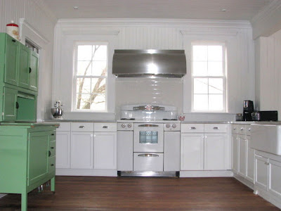 Many readers also mentioned that omitting the upper cabinets is easier when other types of storage are available. This kitchen from HGTV shows a Hoosier cupboard.
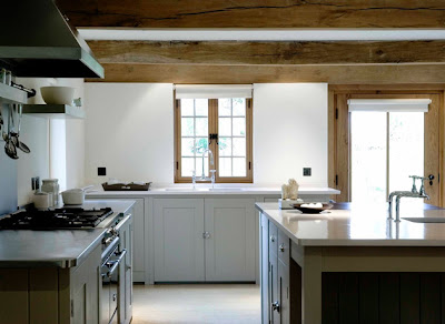 Photos of European kitchens came my way - here is another one from Plain English. This is a favorite of mine, I love simplicity and warmth in this kitchen.
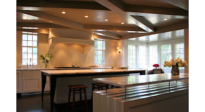 Another blogger directed me to architect Ruard Veltman who often sans upper cabinets. Isn't this kitchen fabulous?!
  Here is another angle of this great room! Notice the wonderful inset shelves on the left.
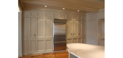 Most readers agreed that having a Butler's Pantry or large wall of cabinetry allowed the rest of the kitchen to be freed up to allow for windows. Veltman outdid himself with this striking wall of cabinetry.
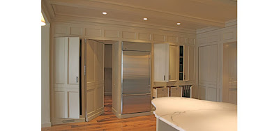 This wonderful paneled wall turns into a trove of hidden cabinets. Spectacular! To see more of Veltman's work